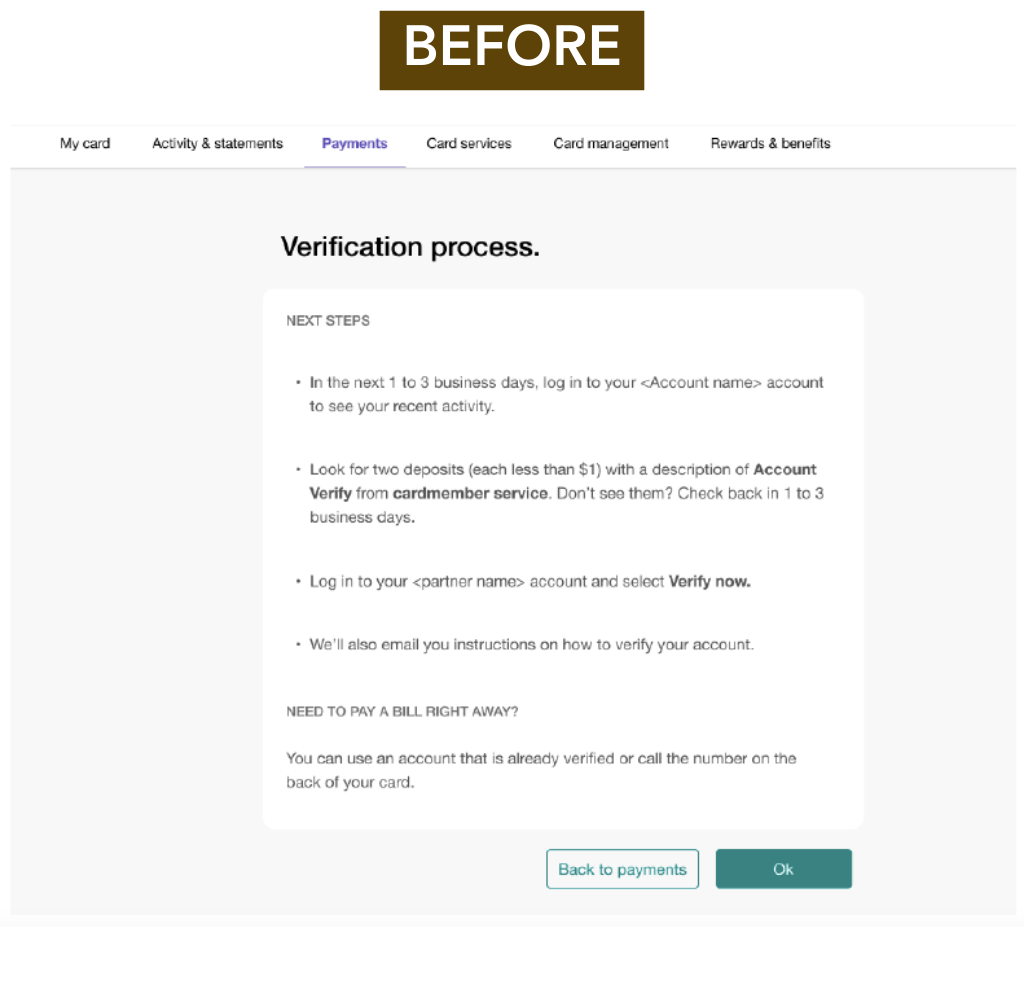
Click images to enlarge
Background
- Project: Account verification update
- Client: U.S. Bank
- My Role: Content Designer
- Objective: Create content that helps customers verify a new payment account easily
- Stakeholders Involved: Product Managers, Visual Designers, Developers, Compliance Specialists, Accessibility Specialist
- Tools Used: Figma
Process
- Determined issues with content: The “before” content was verbose and overwhelming.
- Engaged with stakeholders to assess business goals and audience’s needs.
- Created clear and concise content that helped users through the account verification process. Changes that were made:
- Created an actionable headline (“Verify in 3 easy steps”)
- Labeled each step in the process (Step 1, Step 2, Step 3)
- Removed unnecessary/irrelevant content to increase white space and clarity
- Made the “Ok” button actionable by changing it to “Verify”
- Collaborated with stakeholders to ensure content aligned with goals and was suitable for desktop, tablet, and mobile views.
- Changes helped improve readability, usability, and customer task completion.

